KATINA
PACKAGING
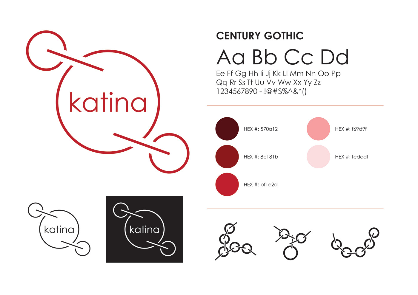
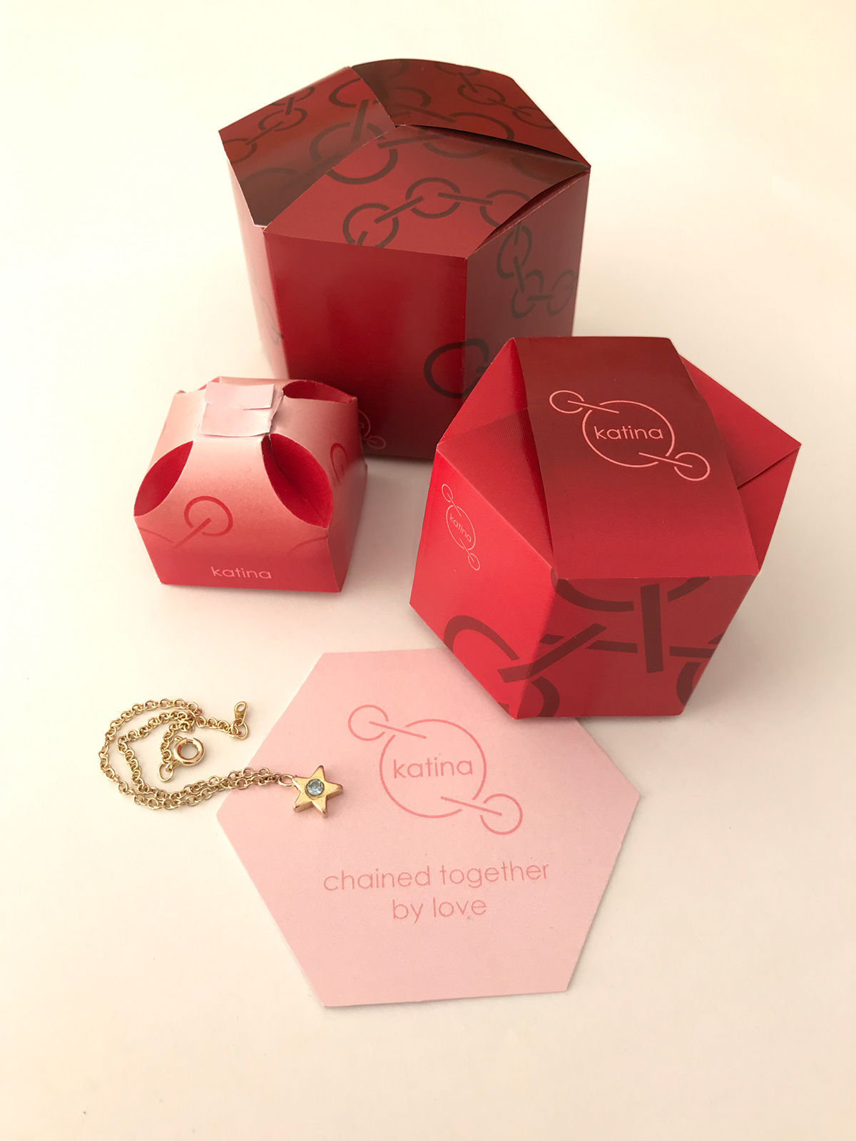
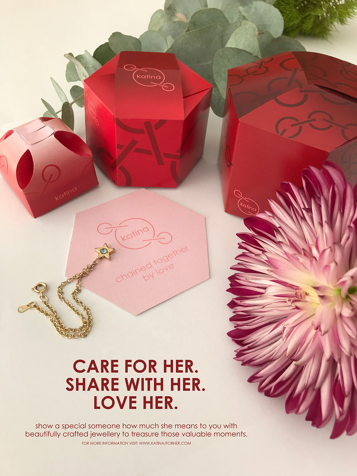
This packaging is inspired by the powerful bonds between women in families. A consistent delicate brand is created with the repeated use of circular shapes in the brand font and patterns. Patterns formed from the logo name unify the concept of bonding and connection through each layer of the packaging.
Warm tones of red communicate love and connection bringing a feeling of value to the process of opening the package.
Constructed as a set of 3 the complexity of the packages represent the complexity of the human condition and emotions associated with gift giving. The packaging set, with its interlocking pieces further ingrains the concept of chains and connection as each band holds the packaging in place as the bracelet, being a gift, would hold firm a relationship. Colour changing packs from dark on the exterior to a vibrant interior represent the layers of a relationship and the notion of digging deeper to reach the core of a person.